Adele Nosova UI/UX Designer
high quality website design, business cards, logo design, cards design
Level V Bakery
Task
As a creative person, I get inspired by so many things in this world, and whenever I am I try to create something even if it is just for fun and there is no real client behind the task. Level V Bakery is not my client, and all work for them was done to hone my designer skills. I decided to create a new logo for this Vancouver cafe.
Whenever I have time, I spend it in Illustrator working on something new
Before
This logo is quite long and is not versatile. The font is cute but it is difficult to understand what the company is doing (of course, the word “bakery” gives us a hint but it does not make it any more attractive for potential customers).

After
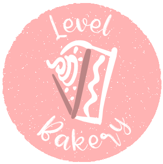
For the background, I used some styling to imitate sprinkles that decorate cupcakes and cakes.
I wanted to use a similar font to preserve the brand identity of the bakery. I found that the Beauty Sunflower font looks like cake frosting which is perfect for a company that sells yummy baked goods.
I transformed the “5” into a piece of cake, and I used a darker hue for it to highlight its meaning.

Color scheme
For this little project, I decided to use a warm color palette in order to make the result look creamy and tasty.
