Adele Nosova UI/UX Designer
high quality website design, business cards, logo design, cards design
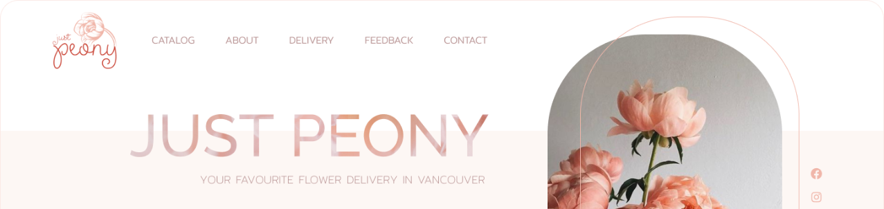
Just Peony | Website Design
Task
For Just Peony, a relatively small flower delivery service that has enough offline customers, being present online is a big game-changer. My main task with this website design was to present the company online and attract more people via the new website.
It was very important to show the previous customers’ feedback to JP’s potential clients.
It was also very important for Just Peony to demonstrate that they work with fresh flowers (especially with peonies).
We’d like our website to stand out.
Ellie, JP owner
Solution
An unusual layout will help your website to stand out.
Blue Corn Moon
For this project, I decided to choose a slightly unusual layout to help the website stand out. To do that, I used different shapes and content alignment. It is not exactly center-aligned but still easy to navigate and access.
A peony is their key symbol, so I tried to highlight its color palette and shape with each bit of the design.
Color scheme
When choosing colors for this website design, I got inspired by peonies’ natural colors — white, pink, reddish. I used bright red as an accent color.
The combination of these colors resulted in a very harmonic and soft-looking website. Just like a peony flower.

Logo
The peony flower has become a significant part of Just Peony’s logo too. It is simple and elegant. Most importantly, the logo is very easy to recognize.
In the future, parts of this logo may be used to design business cards and different marketing materials such as handouts, leaflets, brochures.

Result
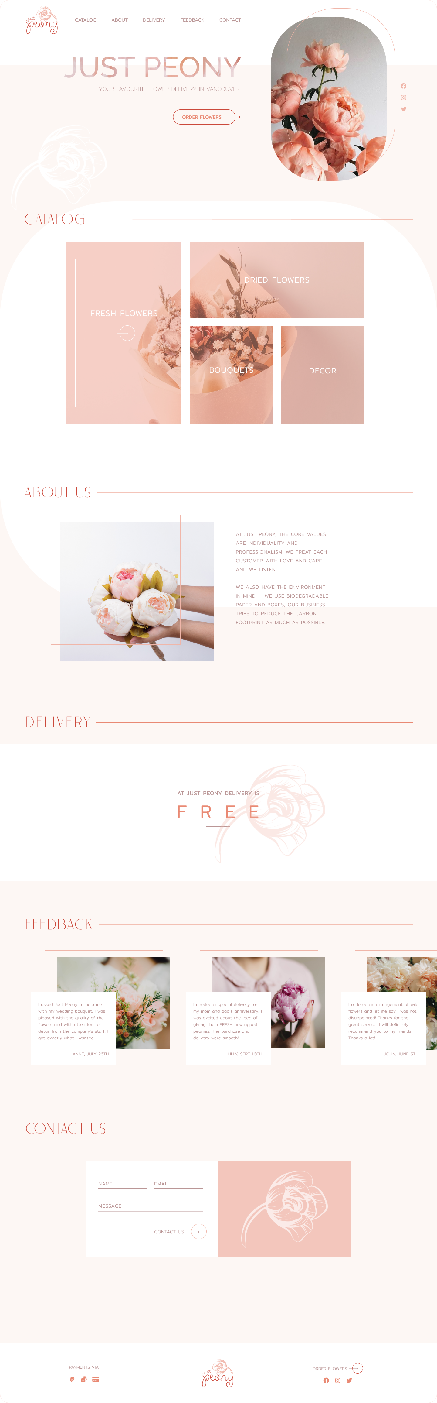
Customer’s feedback
Hi Adele! Working with you was a pleasure — communication, understanding between us, and the result! wow! I’m super grateful. We’ve boosted our online presence thanks to you.
