Adele Nosova UI/UX Designer
high quality website design, business cards, logo design, cards design
Fairy Cakes
Task
The old version of the website was just a one-pager with critical design mistakes that compromised the work of the whole company. One of them — adding a phone number as a picture.
I see this mistake every now and then, especially with small businesses. Such websites are usually made by their relatives or a friend who has some distant knowledge about the user interface and user experience guidelines.
As a result, potential customers tend to leave such a website without ordering from it.
We want our website to attract more customers
Solution
A good website makes it effortless for the user to buy your goods
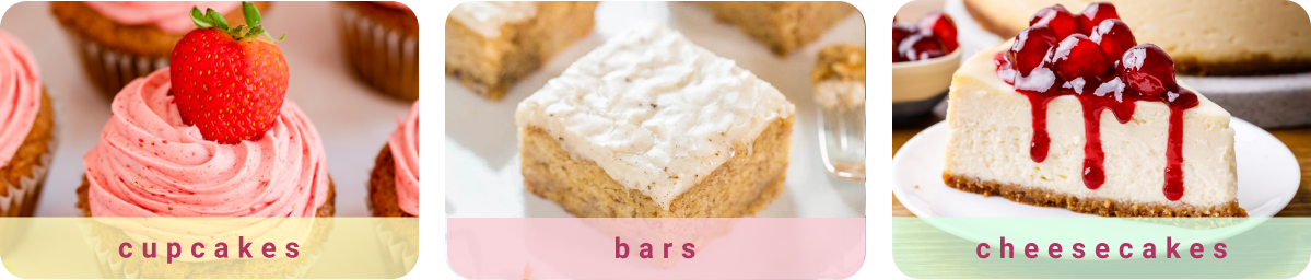
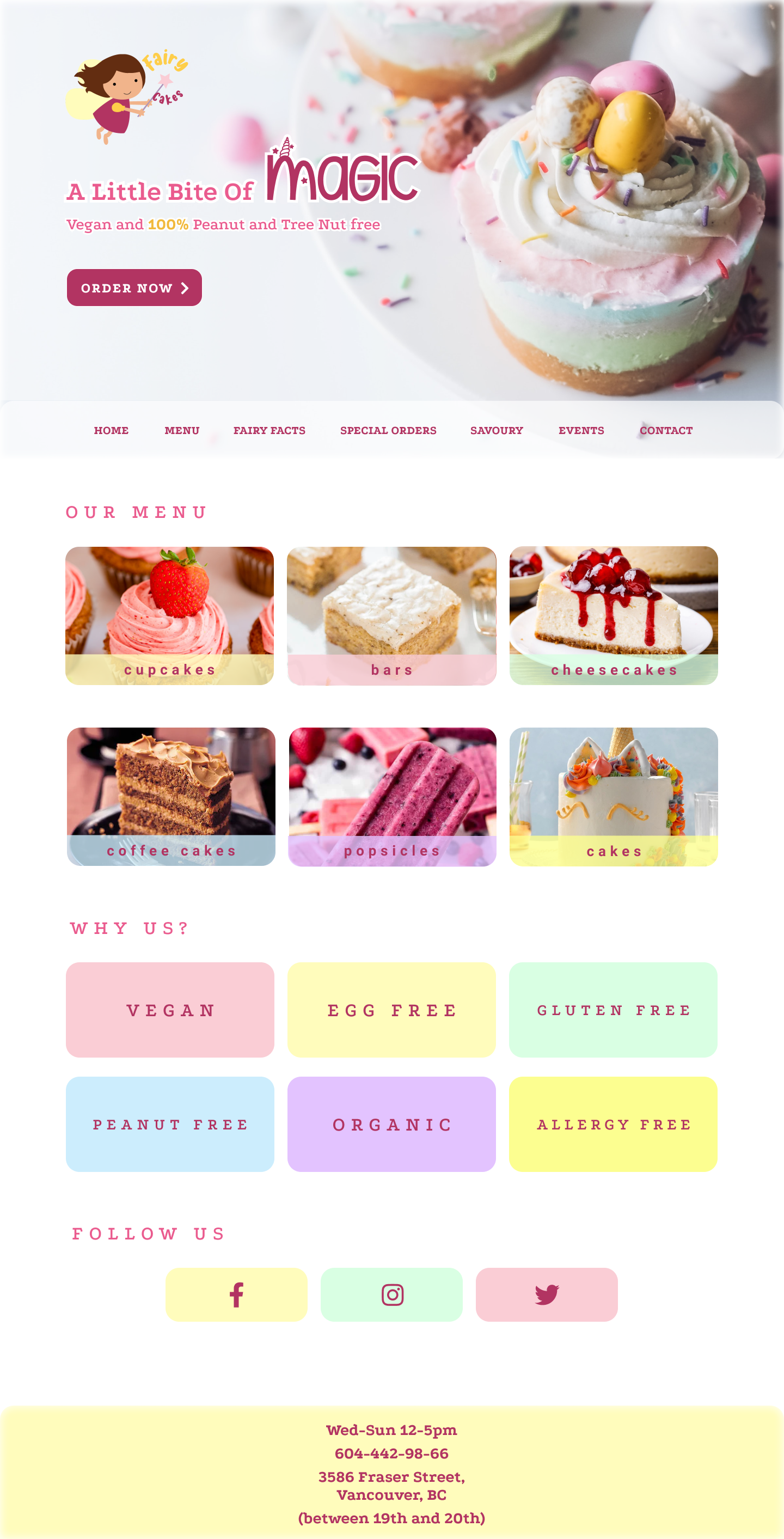
The new website needed to look bright and tasty and scream: we sell the best cupcakes in whole Vancouver!
My first decision was to make their cupcakes the center point of the design. I wanted them to be the first thing a user sees once they visit the website.
And of course, the next step after seeing these beauties should be the call to action — order now! The user needs clear guidance on what to do on your website.
Color scheme
A cupcake store deserves a bright and tasty color scheme, so I used a variety of matching high-contrast colors for this project. Most of the colors were sampled out of the pictures with Fairy Cakes cupcakes.

Logo
According to the legend, and I wholeheartedly believe it, the Fairy Cakes cupcakes are being made by a little fairy that believes in good and also in unicorns.
To create this logo I used the colors that I previously sampled out from the pictures taken by the chef of Fairy Cakes.
This mascot logo should attract more families, especially with small children.
Result
Customer’s feedback
Working with Adele was a pleasure. She works fast, tries to hear everything you want to say and make the best results out of it. Our new website looks like candy. I’m very pleased. Will definitely come back when we need to create promotions and new business cards
