Adele Nosova UI/UX Designer
high quality website design, business cards, logo design, cards design
Fence Squad | Branding
Task
For this gates and fence posts contractor from Ontario, my task was to create branding — in other words, develop a public media image. The ultimate goal for this business was to showcase their previous work, and their capabilities as a trades company, and find new customers.
The main theme for this type of business is, of course, wood. And I gladly used it.
The logo, the color palette, and the overall image are inspired by this material.
We bring quality to the market, and we want our customers to know this.
Rus, Fence Squad owner
Solution
We will use wood as the main idea of your brand.
Blue Corn Moon
Once the late motif of the brand was decided on, it was quite easy to create a matching layout for the website. I mainly used smooth and rectangular shapes to achieve the best eye-pleasing and, most importantly, user-friendly and accessible results.
Also, it was (and always is) very important to give the website users a lot of breezing room — too many details can be overwhelming and are somewhat unnecessary.
Color scheme
The choice of dark brown and light brown hues echoes the natural tones of wood, evoking a sense of warmth, authenticity, and craftsmanship. These colors not only pay homage to the material the company works with but also establish a visual connection with the audience, instilling trust and reliability in their services.
Complementing the earthy tones of brown, the inclusion of dark grey and light grey serves to enhance the overall aesthetic balance and sophistication of the design. These cooler shades provide a subtle contrast, lending a modern and professional touch to the website while maintaining harmony with the wooden theme.

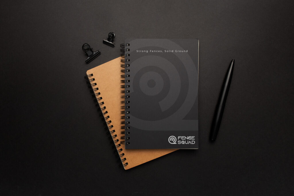
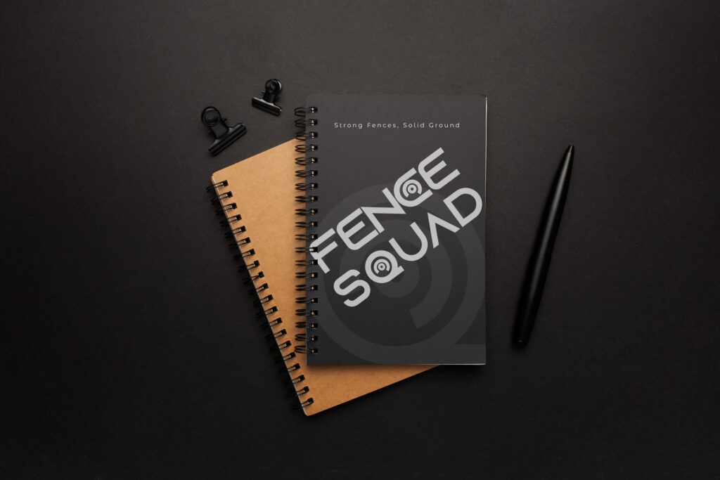
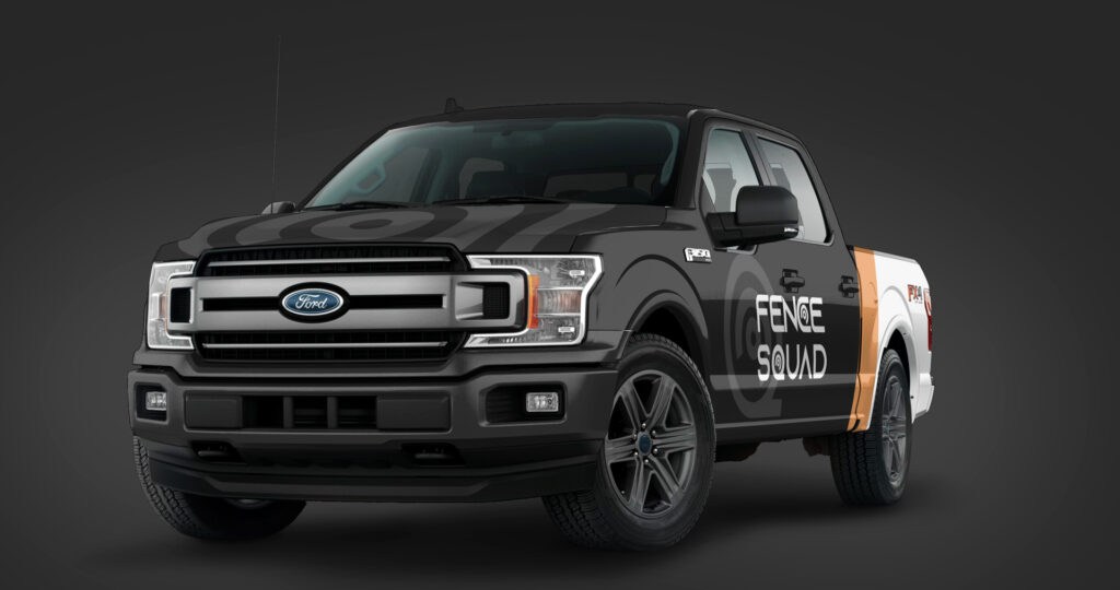
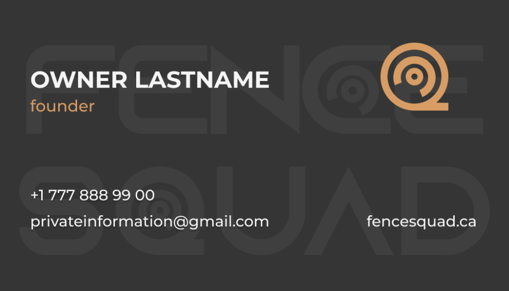
Branding
Result
Customer’s feedback
We are really pleased with how the design turned out. Thank you for bringing this to life! I hope to work with you on our other projects