Adele Nosova UI/UX Designer
high quality website design, business cards, logo design, cards design
Free Love Yoga
Task
Revamp the current website, change the layouts, color schemes, make it more accessible, it should radiate positive vibes of body transformation.
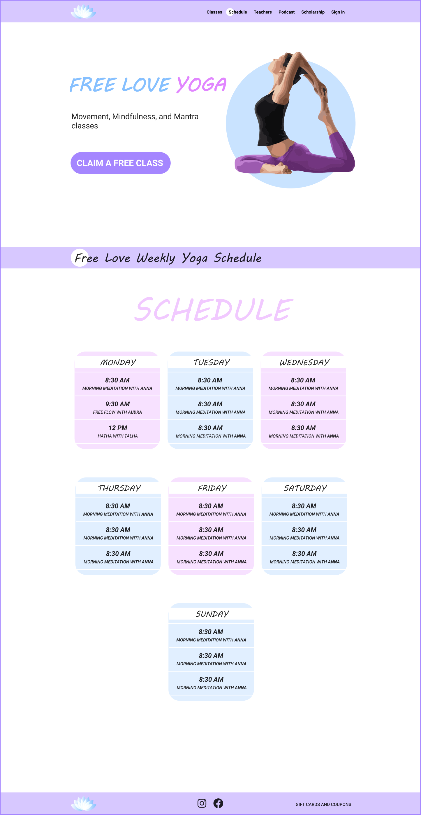
The customers also wanted to make the scheduling function easier and more appealing.
They also wanted a lighter, more positive, look.
It is very important for us to make the website look simple and accessible for everyone
Solution
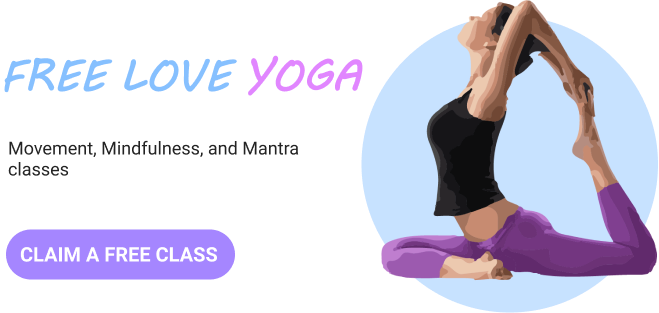
96% of users would leave the website if they did not find useful information in the hero section
The older version of the website looked cluttered and it was difficult to find necessary information. The biggest change I did to the layout. I literally cut the older website in pieces, and then stitched them back together in a more accessible and nice way.
It is especially important to do so with the main (front) page of the website because it takes the user only 3 seconds to decide whether they see the information they need or not. So I had to put the most important sections on top, including the call-to-action button.
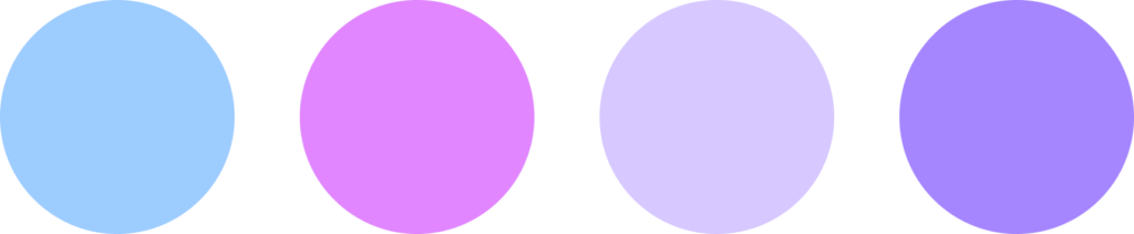
Color scheme
For this project, I decided to use a cold color palette in order to convey the chill and free atmosphere that the studio offers. The background color is white, and the different shades of purple and blue are used for accents
Logo
A logo for Free love yoga studio should reflect their main characteristics — lightness and positive vibes.
One of the most popular asanas and flowers associated with yoga is the lotus flower.
The outer lotus shape symbolizes the person’s body, and the inner white lotus is the symbol of positive vibes that they found while doing yoga at the studio.
Result
Customer’s feedback
My team and I would definitely recommend working with Adele because she was very professional and fast in her work. As a result, we got a cool website as a great addition to our business. Thanks!
